
The short answer: redesign your product when usability bottlenecks, tech debt, or brand drift limit conversion
A full UI/UX redesign is justified when user drop-off exceeds baseline benchmarks, onboarding completion falls below 40%, major new feature additions break your existing navigation hierarchy, or visual design lags modern accessibility standards (WCAG 2.2). A typical web or mobile app redesign in 2026 takes 4 to 12 weeks and costs between $6,000 and $35,000 depending on screen volume and user roles. Crucially, a redesign should never be a purely aesthetic refresh—it must start with user analytics and workflow audits to avoid breaking features existing customers rely on.
Every year, companies spend thousands on cosmetic redesigns that look visually striking in Figma but decrease conversion rates post-launch. In our UX audits across fintech, e-commerce, and SaaS platforms, failed redesigns consistently skip usability testing and fail to document existing user workflows before changing layout architecture. This checklist outlines the exact diagnostic criteria, step-by-step execution phases, and risk mitigation strategies to ensure your 2026 redesign drives measurable business growth.
Diagnosis: Do you need a full redesign or just targeted CRO tweaks?
Before committing budget to a multi-week redesign, evaluate whether your product requires an architectural overhaul or isolated conversion rate optimization (CRO) adjustments:
| Indicator | Targeted CRO Tweak (1–2 Weeks) | Full UI/UX Redesign (4–12 Weeks) |
|---|---|---|
| Conversion Drop-Off | Single form field friction, CTA button contrast issues, unclear headline copy. | Multi-step funnel abandonment, confusing checkout architecture, high onboarding churn. |
| Product Architecture | Navigation is clean, but 1–2 secondary pages lack clear callouts. | New features have been bolted on over years, resulting in fragmented, cluttered menus. |
| Mobile Responsiveness | Minor padding issues on specific mobile screen sizes. | Desktop-centric workflows that break on mobile devices (e.g. unreadable data tables). |
| Design Consistency | Minor typography variations across older blog posts. | No unified design system; buttons, inputs, and modals differ across product modules. |
| Typical Investment | $1,000 – $3,500 | $6,000 – $35,000+ |
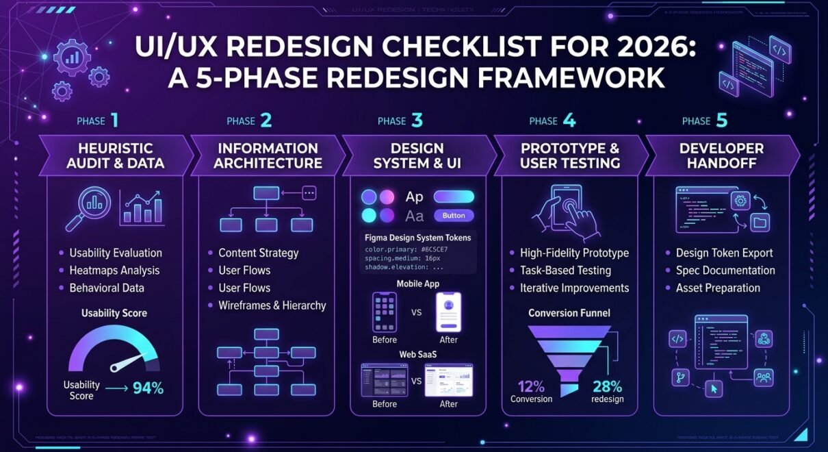
The 5-phase UI/UX redesign execution framework
A successful redesign follows a structured engineering progression from quantitative discovery to developer handoff:
Phase 1: Heuristic evaluation and data audit (Weeks 1–2)
Never start in Figma. Begin by analyzing user session recordings (PostHog, Hotjar), Google Analytics 4 drop-off funnels, and customer support ticket logs. Identify the top 3 friction points where users abandon tasks. In a recent SaaS platform audit, we discovered that 42% of sign-up drop-offs occurred because the password validation requirements were hidden behind a hover tooltip that was inaccessible on touchscreens.
Phase 2: Information architecture and user flow restructuring (Weeks 2–3)
Map the primary paths a user takes to complete core actions (e.g. creating a project, updating billing, inviting a teammate). Reorganize navigation hierarchies into intuitive parent-child structures. Create low-fidelity wireframes that focus strictly on layout hierarchy, content density, and user actions without visual styling distractions.
Phase 3: Design system creation and high-fidelity UI design (Weeks 4–7)
Build a scalable component library in Figma utilizing Auto Layout, variables (color tokens, spacing scales), and WCAG 2.2 AA compliant contrast ratios. Apply this design system across all primary and secondary screens, ensuring dark mode variants and mobile responsiveness are fully documented.
Phase 4: Clickable prototyping and usability testing (Weeks 7–9)
Create an interactive prototype linking key user flows. Conduct moderated or unmoderated usability tests with 5–8 representative users. Testing catches approximately 80% of usability problems prior to writing a single line of production frontend code—saving weeks of costly development rework.
Phase 5: Annotated developer handoff and QA review (Weeks 9–10)
Package Figma files with clear spacing dimensions, component state variants (default, hover, active, disabled, error), empty states, and animation specifications. Designers must collaborate directly with frontend engineers during the build sprint to conduct visual QA checks before release.
Essential pre-launch redesign checklist
Before approving the final design files for frontend development, verify that every item on this checklist is complete:
- All component states documented: Buttons, inputs, and selectors show default, hover, focus, active, loading, disabled, and error states.
- Empty states designed: First-time user views (zero projects, zero transactions, empty inbox) include clear onboarding guidance and primary action triggers.
- Edge cases and character limits accounted for: Layouts support long international names, large financial figures, and multi-line descriptions without breaking containers.
- Accessibility compliance verified: All text meets minimum contrast ratios (4.5:1 for normal text, 3:1 for large text), touch targets are at least 44×44 pixels, and form inputs include explicit visible labels.
- Mobile navigation tested: Complex desktop tables have mobile-friendly stacked card alternatives, and drawer navigation opens smoothly with thumb-zone reachability.
How to prevent the “redesign shock” effect among existing users
Radical interface changes often alienate existing power users who have built muscle memory around legacy navigation. To mitigate backlash and support ticket spikes:
- Preserve core mental models: Do not move critical high-frequency buttons (like “Export Report” or “New Invoice”) to entirely unfamiliar menus unless user testing overwhelmingly proves the new location is more discoverable.
- Introduce interactive onboarding tours: Use lightweight tooltips (via Appcues or custom banners) to highlight the 2–3 most significant workflow updates upon the user’s first login.
- Roll out gradually via beta access: For complex SaaS platforms, allow power users to toggle the “New Design (Beta)” interface for 30 days before deprecating the legacy view, collecting real-world feedback in the process.
FAQ: UI/UX redesign for web and mobile apps in 2026
How much does a UI/UX redesign cost in 2026?
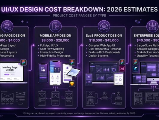
A professional UI/UX redesign costs between $6,000 and $15,000 for standard web apps (15–30 screens), $12,000 to $25,000 for mobile applications (iOS/Android), and $20,000 to $45,000+ for complex multi-role SaaS platforms with full design systems.
How long does a typical redesign take from start to handoff?
A focused web or mobile app redesign takes 6 to 10 weeks across discovery, wireframing, UI styling, user testing, and developer handoff. Enterprise platforms with complex legacy data migrations require 12 to 16 weeks.
Will a redesign automatically improve my search engine rankings?
A redesign improves SEO if it enhances Core Web Vitals (LCP, INP, CLS), resolves broken internal linking structures, improves mobile usability, and reduces bounce rates. However, URLs and metadata must be preserved to prevent temporary ranking drops.
Should we redesign the entire product at once or incrementally?
For early-stage startups and small apps, a complete overhaul is more cost-effective. For mature SaaS platforms with thousands of active users, an incremental, module-by-module redesign (starting with onboarding and settings) minimizes user disruption and development risk.
Planning to redesign your web application, mobile app, or SaaS platform in 2026? Our UI/UX design team at Satsuma Droid conducts comprehensive heuristic audits, interactive Figma prototyping, and developer-ready design system builds. Request a free 30-minute UI/UX audit of your existing product today.