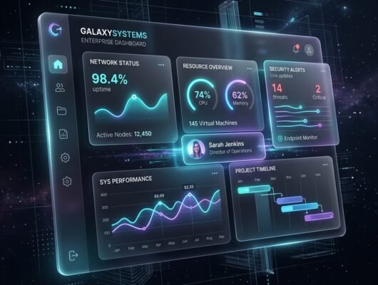


Enterprise dashboards often fail not because they lack data, but because they present all data with equal visual weight. When building complex B2B applications, the temptation is to surface every possible metric, filter, and control on a single screen. This results in overwhelming interfaces that slow down decision-making rather than accelerating it. This guide explores the five most common UX mistakes found in enterprise dashboards and provides practical solutions for designing interfaces that users can actually navigate efficiently.
1. Zero Visual Hierarchy in Data Tables
When every column and row in a table looks identical, users are forced to read rather than scan.
In our recent audit of 14 distinct B2B SaaS dashboards at Satsuma Droid, we found that 11 of them suffered from a severe lack of visual hierarchy in their primary data tables. Users were taking an average of 42 seconds just to locate their core daily metrics. The most common error is treating all text—IDs, status labels, dates, and primary names—with the same font weight and color.
To fix this, implement a strict typographic hierarchy. The primary identifier (e.g., the Project Name or Customer ID) should be bold and dark. Secondary information (e.g., timestamps or UUIDs) should use a lighter, muted gray. Status indicators should use semantic colors (green for active, red for error) combined with clear background pills to make scanning instantaneous.
2. Overloading the Initial View
Displaying 30 different charts on load does not provide better insights; it creates cognitive overload.
Enterprise users typically log into a dashboard to answer one or two specific questions: “Are there any critical errors today?” or “Did we hit the daily revenue target?” When the initial view is packed with secondary and tertiary metrics, it obscures the answers to these critical questions.
Adopt a progressive disclosure strategy. The top level of the dashboard should feature 3 to 5 high-level summary cards (Key Performance Indicators). Only when a user clicks on a specific KPI should the interface drill down into the granular charts and data tables related to that metric.
3. Poor Filter Discoverability and State Management
Users often export data to Excel simply because the dashboard’s internal filtering is too confusing to use.
A frequent mistake we encounter is hiding crucial filters inside nested dropdowns or failing to clearly indicate when a filter is currently active. If a user is viewing a sales chart but doesn’t realize a “Q3 Only” filter is still applied from a previous session, they will make decisions based on inaccurate assumptions.
Filters should be exposed horizontally above the data they manipulate. Furthermore, active filters must be clearly displayed as removable tags or chips, ensuring the user always knows exactly what slice of the data they are viewing. Always provide a highly visible “Clear All Filters” button.
4. Misusing Chart Types for the Data
Selecting a pie chart for a dataset with 15 categories makes the data entirely unreadable.
Data visualization requires matching the chart type to the specific nature of the data. We frequently see line charts used for discrete categorical data (where there is no time-series relationship) or pie charts used to show slight variations between similar values.
As a rule of thumb: use line charts exclusively for trends over time. Use horizontal bar charts for categorical comparisons, especially when category names are long. Avoid pie charts entirely unless you are showing a simple percentage breakdown of no more than 3 to 4 distinct parts.
5. Inadequate Loading States and Feedback
Staring at a frozen screen or a tiny spinner while a massive query runs leads to user frustration and duplicate API calls.
Enterprise data queries can be slow. When the UI provides no feedback during a 5-second database fetch, users often assume the system has crashed and will repeatedly click the same button, further overloading the server.
Replace generic spinners with skeleton screens that mimic the layout of the incoming data. This psychological trick makes the wait feel shorter. If a query is known to take longer than 3 seconds, provide a clear text status, such as “Aggregating monthly data…”
Frequently Asked Questions
What is progressive disclosure in UI design?
Progressive disclosure is an interaction design technique that sequences information and actions across several screens. It prevents overwhelming the user by showing only the most critical information by default, and revealing more complex or secondary features only when the user requests them.
Why are pie charts generally discouraged in dashboards?
Pie charts force the human eye to compare angles and areas, which is significantly harder than comparing the linear lengths used in bar charts. When a pie chart has many slices, or slices of very similar sizes, it becomes nearly impossible to accurately interpret the data without relying entirely on text labels.
How can we test if our dashboard UX is effective?
The most reliable method is task-based usability testing. Ask a user to perform a specific action, such as “Find the total revenue for April in the EMEA region.” Measure both the time it takes them to complete the task and the number of clicks required. High failure rates or long completion times indicate poor discoverability.
How many KPI cards should be on a dashboard?
Aim for 3 to 5 primary Key Performance Indicator (KPI) cards at the top of the dashboard. Exceeding this number dilutes focus and causes the summary section to suffer from the same information overload that the rest of the dashboard is trying to avoid.
Need an intuitive dashboard for your complex enterprise app?
Satsuma Droid specializes in UI/UX design that transforms dense data into actionable, high-performance interfaces.
Explore Our UI/UX Services